Our Swan Badge
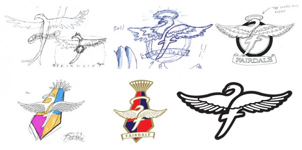
Searching through some old drawing books I found some original sketches for our Swan badge. Fairdale is 5 years old now and we’ve done lots of growing and changing since then. One item that has stayed consistent is our headtube badge.
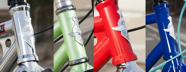
It was really important for us to get it right the first time. Once we embossed that first badge we hoped to be able to keep it unchanged for many years. Outside of toying with a few colors we’ve kept it untouched and are very happy with it.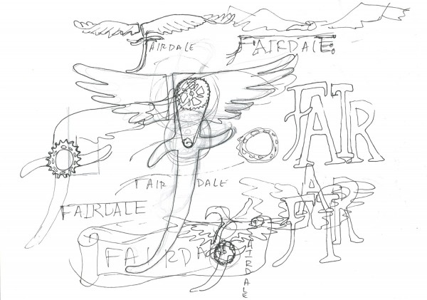
This is one of the first sketches I could find and I’m already sure about using wings in the logo. Of course wings in logos is nothing new. For Fairdale I really wanted to represent the idea that bikes can take you places you otherwise wouldn’t go. Even if it’s as mundane as riding the same route you normally drive to work… seen from a bicycle, the world opens up.
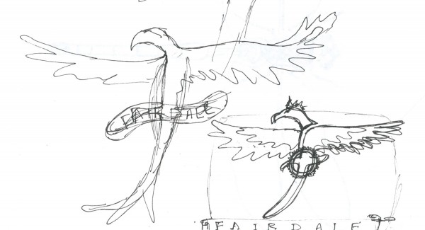
The idea to incorporate “F” into the design took a lot of figuring out.
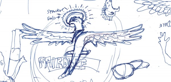
I do remember being stuck on this idea that our bird should have a sprocket as a halo. I thought it looked very classic.
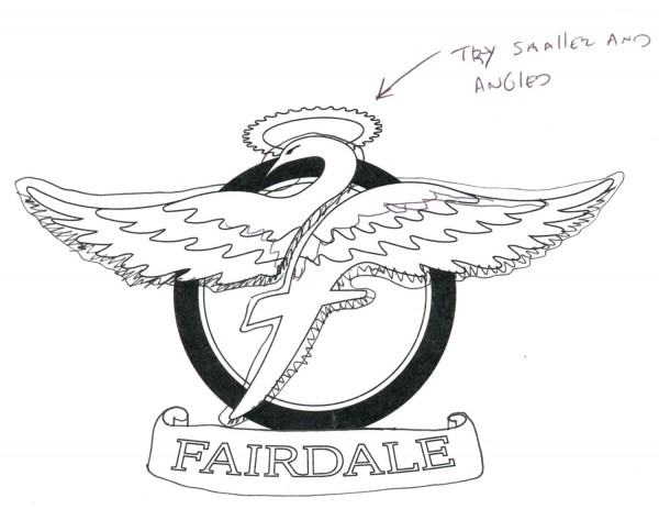
I kept trying and re-trying to make the halo work. And at the same time started to focus in on the general shape of the “F” in the bird (which about here had become a white swan to me).
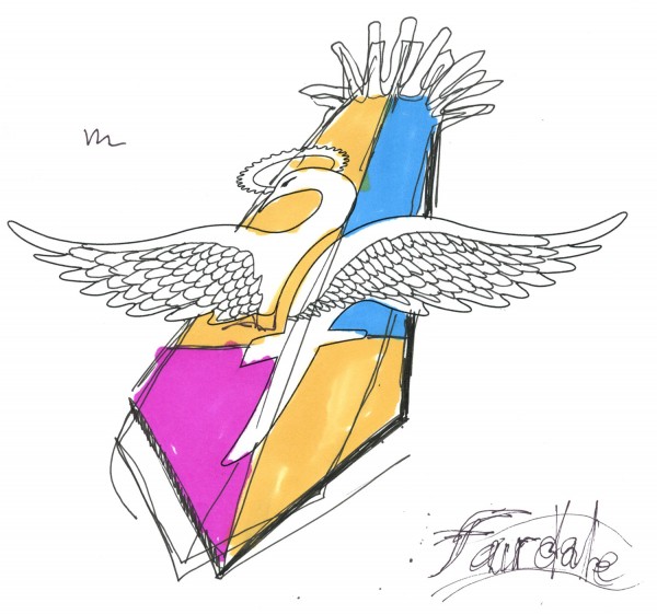
Fairdale was really lucky to have Jim Bauer and Chris Cotsonas an email and desk away from me during this phase of design. They helped hone the idea down into a cleaner and more focused icon.
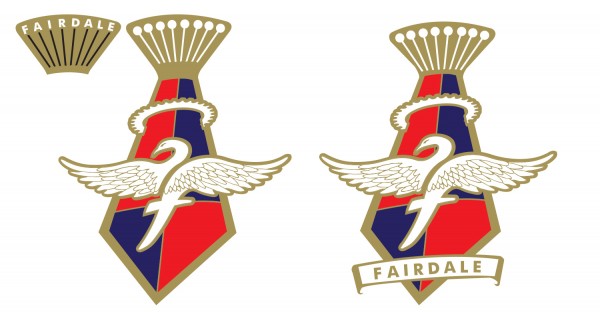
I eventually decided (with some prodding) that the halo was both a little unclear and touching on some possible religious territory.
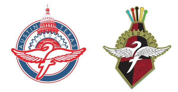
We got the feathers almost right on the version with the Texas Capitol building, and we found a new way to keep my sprocket in the logo too.
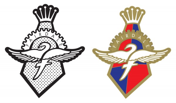
And finally we finished our first version of the badge (which ended up being chrome not gold).
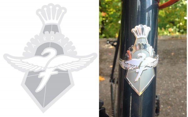 This is the modern day badge you’ll find on your Fairdale.
 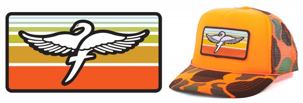 And of course the Swan has been used on many of our soft goods and stickers.
