Logo mania
All mega-corporations need a good logo. Here at Fairdale we know we are no different. Been playing with all kinds of logos lately… not sure any of these are permanent. Fun to mess around with though.
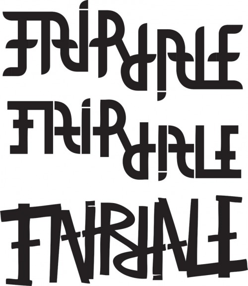
The OG logo. This logo is like close to 2 weeks old.
Eh… not so much.
Rrrrrrr!
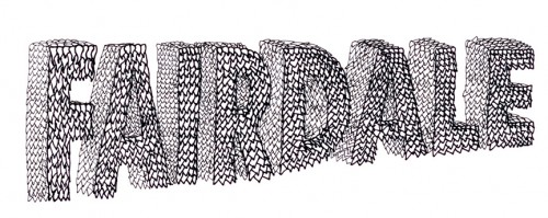
I wanted this on to look like leaves….
…but it looked more like a dragon to me. Dragons don’t impress people the way they used to though.
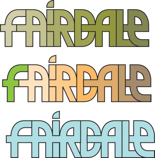
Clean logo in some different variations.
Narrow?
Do you know those things where the words can flip around upside down and it still reads the same? That’s what these are.
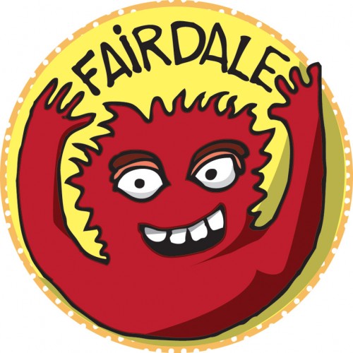
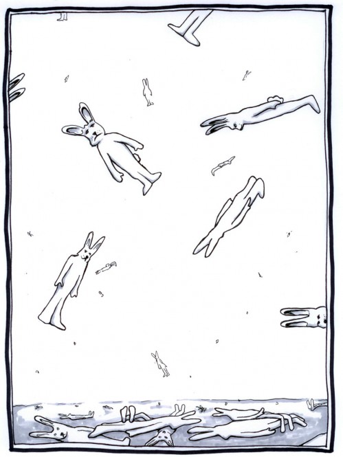
And every company needs a mascot… this is probably to T-1 ish though.
Back to the drawing board….





![Sieben & Fairdale collection available now!
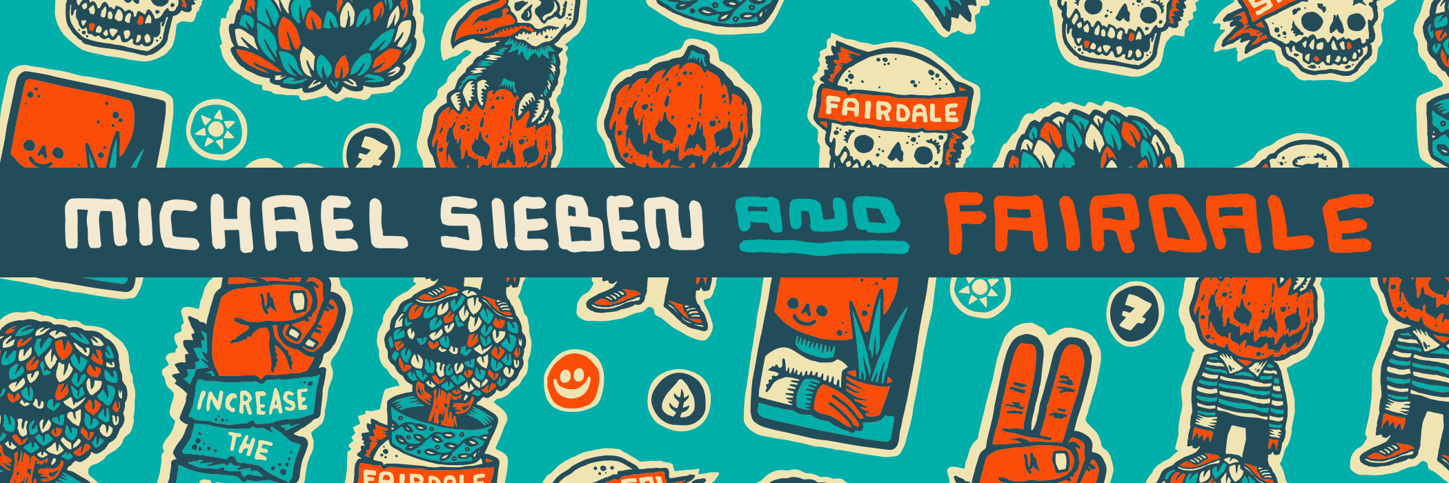
Welcome to our new artist bike by Michael Sieben. We are huge fans of Mr. Sieben and are honored to feature his work.
Many years ago, I worked with Michael at my old BMX company, T-1 [Terrible One]. Michael was amazing as our art director. He had an endless amount of creativity and good humor. It was always inspiring to be around him. And, it still is!
Now, 25-ish years later, I get to work with Michael again. This time, he turned our Weekender Nomad MX model into an artist bike. The bike is one of our favorite models, and it means a lot to us. The Weekender line is what Fairdale is all about–a bike that cycling nerds like us and our friends who maybe haven’t spent their lives obsessing over bikes all love to ride. Adorned with original Michael Sieben art, this deluxe Weekender MX artist model is extra super special.
Thanks to Mr. Sieben for being part of the project. We hope you enjoy the @sieben_up & @fairdalebikes Weekender.
-Taj
Big thanks to @t1stagram for the old photos and video. And @devonhutchins for putting together the video.](https://fairdalebikes.com/wp-content/plugins/instagram-feed/img/placeholder.png)